 COVID19 shiny app
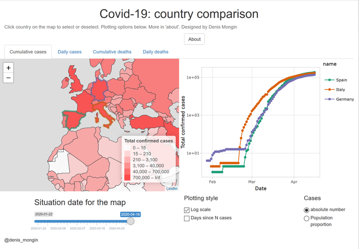
During the Sars-cov-2 COVID19 pandemy, I did a shiny app to visualize the COVID19 case and death data in the world and compare the data between countries. Although some apps were available at the time, I did not find one that proposed all the features I wanted:
- select and compare data of various countries
- be able to change from linear to log scale
- have both the data on the map for a date you can choose and the plot giving data (cases or deaths) in function of time
- have the possibilty to switch from absolute number to per capita
Few days after, ourworldindata released their wonderful interactive graphs, that did answer all these features.
In the meantime, I managed to include all this features in my shiny app, resulting in a good example of what is possible to do with Rshiny, leaflet for the map and ggplotly for the plot. The result is here, and the code is given in the gitlab link in the beginning.